
Redesigned Wingo’s Help Center to create a clearer, more intuitive support experience. The project focuses on simplifying how users find information through a structured layout, improved navigation, and a system of frequently asked questions and short-form articles.
Description
Client
Wingo
2025


48-hour pre-flight email
Wheelchair assistance email
Wingo’s Help Center
Explore final iterations
Click on each design to view the full prototype
Design Process
Analyzed detractor data in Excel and organized it into key categories.
Detractor Analysis
User Insights
Validated pain points and uncovered issues around unclear policies, hidden fees, and baggage confusion.
Solution Exploration
Proposed improvements across key touchpoints: Help Center, emails, and information structure.
Design & Iteration
Delivered clearer content, improved navigation, and enhanced communication across the user journey.


unclear policies (32%)
personal item allowances (35%)
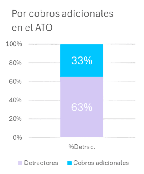
additional charges (33%)
Data Insights
96 travelers (MDE, SMR, BOG) · 38% detractors
Problem
Solution
Users report a lack of clarity around flight policies and encounter unexpected or hidden fees throughout the booking process on web and mobile.
Improvements across key touchpoints to make information clearer, more intutitive and easier to access: Help Center, pre-flight emails, special needs support, and content structure.
Andrea Serrano